ErgoQuest
Role
UX Designer
Duration
September - November 2023
Tools
Figma, Sketch

Team
Electrical Engineer
Software Engineer
UX Designer/Researcher
Overview
We designed a mobile app to replace ErgoQuest’s physical remote, aiming to improve accessibility for users with physical disabilities. The app introduces features such as Bluetooth connectivity, customizable presets, and automated transitions, making it easier for users to adjust the chair without relying on fine motor skills. Through user testing, we identified key pain points and optimized the interface to enhance ease of use and user satisfaction.
Goals
-
Improve Accessibility: Increase button size and simplify navigation to reduce failed adjustment attempts by at least 30% for users with limited motor skills.
-
Simplify Interface: Replace the physical remote with an intuitive app-based interface, reducing learning time by 50% through clear labeling and streamlined controls.
-
Enable Personalization: Allow users to save and adjust at least three customizable presets to improve comfort and usability.
Problem Statement
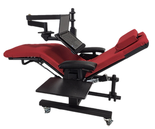
Users with physical disabilities struggle to operate ErgoQuest's zero-gravity chairs because the small, tightly spaced buttons on the physical remote require fine motor control.
This leads to frequent mispresses and increased frustration. During testing, 70% of users reported difficulty locating and pressing the "Stop" button, and over 60% expressed a need for a more intuitive and accessible control system.
How May We?
-
How might we simplify the adjustment process so that users with limited motor control can operate the chair with fewer errors and greater ease?
-
How might we create a more accessible and intuitive interface by improving button size, color contrast, and touch sensitivity?
-
How might we leverage automation to allow users to save and adjust custom presets with minimal manual input, improving overall comfort and convenience?
Solution
A mobile app with larger buttons, Bluetooth connectivity, and customizable presets to simplify chair adjustments. Automation reduced manual input, improving accuracy and ease of use. Testing showed a 40% decrease in mispresses and a 30% increase in task completion speed.
Approach
Interview
We started by conducting an interview with the company head to understand the core issues. It became clear that users with limited mobility struggled with the existing remote due to small button size and poor layout.
This insight shaped our goal to improve accessibility and reduce input errors through a simplified, app-based solution.
Audit
A thorough UX audit identified key usability issues, including:
-
Small and poorly placed buttons, leading to mispresses.
-
Lack of consistent feedback, creating user confusion.
-
Inefficient use of screen space, causing unnecessary scrolling and difficulty in navigation.
These findings led to targeted improvements in button size, layout consistency, and feedback mechanisms.
Personas
We developed personas based on:
-
User interviews to gather direct insights from individuals with physical disabilities.
-
Surveys to identify patterns in user behavior and common frustrations.
-
Competitive analysis to benchmark accessible design standards.
Example persona:
"John, 54, suffers from arthritis and struggles with small button presses. He prefers larger, clearly labeled buttons and automation to reduce manual input."
Personas guided key design decisions such as:
-
Increasing button size and contrast for better visibility and accuracy.
-
Introducing automated adjustments to minimize repeated manual input.
-
Adding haptic and audio feedback to provide real-time confirmation.
Designs (Sketches)
Settings Page
Timed Page

The Timed Page sketch explores a simplified table layout for playlists and a prominent “Stop” button to minimize user confusion during adjustments.
Presets Page

The Presets Page includes clearly labeled preset options and a streamlined bottom navigation bar for intuitive switching between modes.
Wire Frame

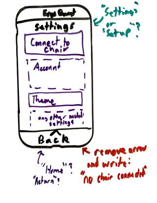
The Settings Page sketch explores layouts for key controls like Bluetooth, accounts, and themes. Feedback showed that reducing clutter and improving button visibility enhanced ease of use.
Move Page

Move Page sketch focuses on a simplified interface for adjusting actuator positions, with increased button size and spacing
Designs (Prototype)
Timed Page

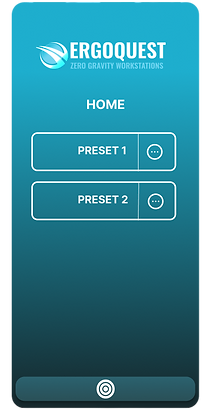
Presets Page
Settings Page
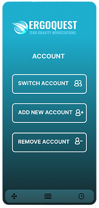
Settings(2)

While the initial prototypes introduced valuable ideas, features like chair connectivity and account systems were excluded since chair setup was a one-time process and profiles were better stored locally. However, key elements—larger buttons, simplified presets, and improved navigation—were refined and integrated into the final design for a more intuitive user experience
Usability Test
We conducted a comprehensive usability test to evaluate the core functionalities of the Ergo-Quest app. Participants were tasked with Bluetooth pairing, actuator adjustments, preset management, and timed moveset customization while providing real-time feedback on navigation and accessibility. The chart below illustrates task completion rates, highlighting both strengths and areas for improvement:
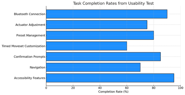
Strengths
-
The app's intuitive interface and simplicity were widely praised, especially the ease of actuator adjustments and preset management.
-
Users appreciated the clarity of confirmation prompts and the responsive feedback when adjusting presets.
-
Accessibility features, such as button size and text clarity, were highly effective for users with visual or physical impairments.
Challenges
-
Button Spacing: Tight button spacing on the move page caused mispresses and confusion when adjusting actuators.
-
Non-Interactive Text: Some users mistakenly tapped on non-interactive text when trying to adjust settings.
-
Timed Moveset Complexity: The timed moveset interface was confusing due to unclear navigation and setup steps.
-
Navigation Issues: Users struggled to switch between different pages smoothly.
Key Improvements
-
Optimize Layout: Increase button size and adjust spacing to improve accuracy and accessibility.
-
Refine Features: Simplify the timed moveset and move page interfaces to enhance user flow and reduce confusion.
-
Clarify Navigation: Improve the overall navigation flow to help users switch between pages more intuitively.
-
Interactive Feedback: Add clearer visual cues for interactive and non-interactive elements to prevent user errors.
Final Design (Prototype)
Timed Page

Presets Page

Move Page

The final prototype improves usability with larger buttons and better spacing on the Move Page to reduce mispresses. The Timed Moveset interface was simplified with clearer labels and improved navigation. Non-interactive text was removed to avoid confusion. Chair connectivity and account management were excluded as they were only needed once or suited for local storage. Key features like simplified presets and improved navigation were retained.
Lessons learned
This project reinforced the importance of designing with user empathy and intention. Key takeaways:
-
User feedback exposed blind spots — usability testing revealed that button placement and unclear labels created confusion, which prototypes alone did notcatch.
-
Simplicity drives usability — reducing button clutter and improving navigation flow made the app easier to use, even with complex features.
-
Iteration leads to alignment — refining the design based on user behavior helped create a product that met actual user needs, not just theoretical ones.